Confused by Contemporary Art

If Salvador Dali was the strangest man that ever lived, then Andy Warhol was the creepiest. While I am fascinated by Warhol’s Pop Art and am inspired by his unrelenting efforts to make a name for himself, my biggest take-away from the documentary was his personality. I loved the bit about the leather company that he worked for, when the owners described him as “never fake” and as having an “inner-charm”. However, after he gained his stardom, he became an enigma – and listening to him speak was almost uncomfortable. I find it interesting that he branded himself, and that his deadpan, mysterious personality is almost laughable – it’s like he could get away with anything because the public could say, “well, that’s Andy for ya”, and brush it off.

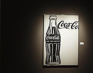
I like Andy Warhol’s pop art. I think the reason why, though, may be due to the fact that they are his works and not necessarily because I like the works themselves. One of my favorite Warhol’s is Coca-Cola. I found this interesting because when I think of Andy Warhol, I typically envision the Campbell’s soup prints or the Marilyn’s. I never would have pictured Andy doing a piece in black-and-white as he did with the Coca-Cola. I like the crisp lines in this piece and the geometrical planes in the bottle. I also find it interesting that he cut off “Coca-Cola” on the top-right. It’s almost as though Andy was making the point that the consumer would know what he was depicting without needing a full representation.


coca cola

Andy Warhol, ~1960


Something that I love about Andy is that he allows his art to be interpreted by the viewer however he or she wants to see it. When asked to describe a work, he would frequently say “it means nothing”. This seems to hit the debate about contemporary art head-on, as many critics view it as having no meaning. This resonates with me, as I myself have a difficult time analyzing and appreciating contemporary art. I was excited to go to the World Goes Pop exhibit at the Tate Modern for class; however, I struggled to find a piece that I liked. I do not feel connected to contemporary art, and it frustrates me because I want to like it, but I can’t find a way to. I feel as though all aspects of composition that we have learned about go out the window when discussing contemporary art, so it leaves me feeling as though I don’t know where to begin.

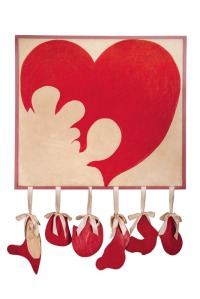
I was only able to find one piece at the exhibit that I really felt I could connect with. Broken Heart by Delia Cancela first caught my eye with its bright red colors and the hanging pieces. However, it wasn’t until reading the prompt underneath of it that I really felt this connection. I think this is my problem with contemporary art – because I am not visually drawn to it, I need to have a reason to feel like I can relate to it in order to appreciate it fully. Broken Heart spoke to me because I feel it is something that not only myself, but almost everyone at some point in their lives, has experience with. I found it very accurate and raw that the hanging pieces could represent either organs or the pieces of a broken heart, showing the idea that a broken heart can cause visceral pain that takes over your entire body.


cancela

Broken Heart, Delia Cancela, 1964


As I mentioned before, I want to like contemporary art. I hope that if I continue to expose myself to it, I can start to gain an appreciation. At this point, though, I’m kind of feeling Damien Hurst when he says he wants to “make really bad art and get away with it”, as that could be true for many contemporary artists.

I think I’ll draw the line at Surrealism.

Posted in 20th century art, contemporary | Tagged , , | Leave a comment

The Building Blocks of the Unconscious Mind

In the same era that artists such as Pablo Picasso were establishing cubism, another movement came to shake up the art world – surrealism. I studied Salvador Dali briefly in high school, and I have always been captivated by his very strange works of art. I was very interested in the documentary we watched in class because of Dali’s weird quirks and style of painting. I can see exactly why he gained such popularity in the 1900’s, because I was also drawn in by his weird personality and was fascinated by everything he did. To be honest, he strikes me as the strangest person to ever live, but that’s what I like about him. Dali was unapologetically himself, and confident to the border of arrogance. He was the first Lady Gaga of the modern world.

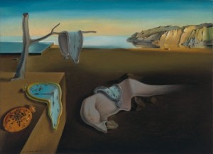
Have you ever woken up from a dream and thought, “What on earth was that all about?” Surrealists were interested in capturing that moment, in representing the unconscious mind’s role in dreams, in it’s affect on the conscious mind, and in the irrational and the illogical. The one work that I have always recognized as Dali’s is The Persistence of Memory, painted in 1932. This painting is the epitome of surrealism – it’s background is seemingly realistic, but in the foreground, Dali warps ordinary objects and distorts them with the inner workings of the unconscious mind. I feel like I am in a dream when I look at this painting, as if I am standing on the vast plains and staring at the melting clocks before me. I think that is the point of this painting – to emphasize the role that memory may have on one’s unconscious psyche.


dali persistence

The Persistence of Memory, Salvador Dali, 1932


To me, the focal point of this painting is the melting clocks. However, when I look more closely, I notice the ants on the left-hand side, and that weirdly disfigured shape in the middle. Upon further researching this painting, I learned that this morphed figure is actually an eye and a nose on its side, complete with eyelashes. Some speculate that this is Dali’s attempt at self-portrait. I personally have no idea why he included this or what it’s meaning is meant to be, but I don’t think Dali would have cared either way. I think he wanted you to speculate so as to spark controversy and conversation.

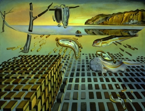
While watching the documentary, I was actually most intrigued by Dali’s works during the Cold War, when he began to develop an obsession with nuclear physics and the idea that matter is composed of atoms. During this time, he re-did some of his most famous works, but this time, he applied his knowledge of nuclear physics. I love his painting The Disintegration of the Persistence of Memory, created from 1952-1954. I am actually much more attracted to this painting than I am to his original Persistence of Memory. 


dali disintegration

The Disintegration of the Persistence of Memory, Salvador Dali, 1952-54


I consider this painting even more surreal than the original. I love the perspective Dali used in this painting, as if the objects are being sucked in a vacuum towards the back of the painting and we are being sucked in along with them. I find it interesting that the building blocks were not the only alteration to his original work. He also included a reflection of the cliffs in the background and a fish coming out of the sea. The ants are not included in this painting, and the morphed eye/nose figure is less detailed than the first. I love the vibrant use of color in this painting and the way the light hits the building blocks, making them look almost three-dimensional. The clock in the center even looks like it’s floating. This is my favorite piece out of all of Dali’s works, and I really appreciate how he applied science (reality) and was still able to make it seem so surreal.

I would assume that many budding artists want to create art that viewers can look at and say “That’s a ____.” Dali accomplished just that – I would find it hard to believe that many people could look at his paintings without knowing right away that it’s his. To me, that’s a mark of a phenomenal artist and one who’s work will live on forever – someone who can create something so different that will remain different as time goes on.

Posted in 20th century art, contemporary | Tagged , , , , | Leave a comment

Tearing Reality Apart

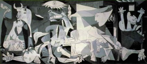
In April 1937, the Spanish town of Guernica was bombed by Nazi Germans during the Spanish Civil War. Pablo Picasso, already an established contemporary painter at this time, dedicated six weeks on a larger-than-life painting capturing the absolute horror of this event. This thirty meter painting, called Guernica, then went on to be showcased on tours around the world as the centerpiece of anti-war protests.


guernica2

Guernica, Pablo Picasso, 1937


I surprised myself when I noticed my attraction to this painting. It is on the opposite realm of everything that usually draws me in — color, realism, romance. Instead, this painting is dark, it’s contemporary, and at first glance, it’s really quite weird. But when I look closer at each figure and think about Picasso’s intentions in regards to the context, I am captivated by it.

The figures in the middle are jumbled, which to me represents the slain bodies after the bombings. There is the head of a horse above them, and the horse has a look in its eyes that reflects pure terror. On the right and left of the painting, there are women. On the right, the woman has her hands raised in the air, and one of them looks mangled, as if she was maimed in the bombings. On the left, however, is the most heart-wrenching aspect of this piece – a woman screaming, holding her dead child.

I have never felt emotion from a painting like the way I feel looking at this woman. Her face is drooping, as if the aspects of her physical body are deformed by the searing emotional pain she is experiencing. Her tongue is piercing out of her mouth like a sharp point, and I feel as if I can hear the high-pitched wail of a woman grieving over her child. I can’t stop looking at this woman and thinking about her pain. I feel as though this experience would have been so relatable to people from all over the world at this time – the start of World War II – as many of them would be losing their loved ones to war as well. I think the reason this piece was so popular is because of this common sense of loss and fear of feeling the same pain as this woman, and I can assume that this greatly contributed to its success as anti-war propaganda.

In terms of formal analysis, this painting is also interesting because the subjects of it are flat, but there is a certain depth to it as well. The white figures are brought forward from the dark background to create space. The structure of the painting is confusing, and I feel as though I don’t know where to let my eyes rest. I think that adds to the violent atmosphere, as if you as a viewer are also affected by the chaos going on inside the painting. Picasso was quoted saying he wanted to “tear reality apart” in his works, and I think that is exactly what this piece is doing.

Posted in 20th century art, contemporary | Tagged , , | Leave a comment

Bathers through the 19th Century

I have been looking forward to the week dedicated to Impressionism and Post-Impressionism since I first noticed it on the class syllabus during week one. Impressionism has always been my favorite genre of art – I fell in love with it during a class I took in high school, Art Major. In this class, we spent several weeks studying Impressionism – specifically through the works of Claude Monet – and he quickly became my favorite artist. I painted my own replication of his work, Wild Poppies, as well as an oil pastel replication of his work, The Artist’s Garden at Vetheuil. Now, I feel that I incorporate aspects of impressionism into anything that I paint, and I find that I am consistently drawn to works of art that carry impressionistic traits in any form.

Naturally, then, when I walked into the National Gallery and found a room filled with Monet’s, I was practically bouncing out of my skin with excitement. To my slight dismay, I was assigned to study a Manet, a Seurat, and a Cezanne, each of which do not necessarily appeal to me in the same way that Monet does. However, as I broke down each of these paintings with my partner and then circled back to study the Monet’s, I realized that there was a common subject among the works of three different artists – bathers.

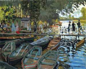
I’ll begin by examining these paintings in chronological order. This brings me to Bathers at La Grenouillere, painted in 1869 by Claude Monet. The movement of Impressionism brought a radical change to the world of art – it focused on the capturing of light in paint and was characterized by visible brushstrokes. Typically, Impressionist artists did not feel the need to mix paint before using it. This work of art by Monet was created towards the beginning of the Impressionist period, and it is not a coincidence that it was painted by the leading Impressionist himself. While I would not say this is my favorite Monet, I still find myself electrified by this painting. I am in awe of Monet’s creation of details even though his style of painting lacks detail itself, and I love how through small brushstrokes and vibrant colors he is able to create an image of reality, of typical everyday life.


monet bathers

Bathers at La Grenouillere, Claude Monet, 1869


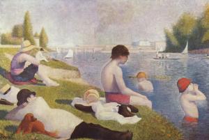
Next, we move along fifteen years later, to Bathers at Asnieres created by Georges Seurat in 1884. Seurat was a revolutionary artist in the nineteenth century – although he began working as an Impressionist, he started to experiment with structure and took advantage of the new idea of complementary colors. Seurat coined a new style of art – pointillism – which uses tiny dots of complementary colors placed closely together to create the illusion of reality. In this painting, we see Seurat utilizing his impressionist background, but beginning to draw on his newfound aspects of pointillism. Complementary colors seem to be the focal point of this work, and he seems to rely on the contrasts between blue and orange and red and green to create the vibrancy of life on the riverbank. To me, this painting falls somewhere between impressionism and contemporary art, and we begin to anticipate the transition to our next artist, Cezanne.


seurat bathers

Bathers at Asnieres, Georges Seurat, 1884


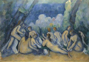
Finally, we come to Paul Cezanne, a Post-Impressionist artist that started the movement away from Impressionism and sparked a radical, modern change. His 1894 painting, Bathers, was created towards the end of his life, when he was no longer experimenting but rather had an established style of painting. I only see mere traces of impressionism in this work of art due to its vibrant use of color – specifically complementary colors. Instead, I see this painting as the beginning of abstract art. Cezanne uses thick layers of paint and vague detailing, but still gives the painting structure with the use of diagonals and solid blue outlines for the figures. Rather than evoking a sense of romantic, entranced feelings typically brought on by impressionism, Cezanne’s artwork brings you face-to-face with solidarity and simplicity. One could argue that Cezanne had established himself as the pioneer of modern art.


cezanne bathers

Bathers, Paul Cezanne, 1894


Posted in nineteenth century art | Tagged , , , , , | Leave a comment

The context of the Pre-Raphaelites

During the first episode of our documentary on the Pre-Raphaelite Brotherhood, I was unimpressed. I did not find myself drawn to these paintings in the same way that I was drawn to Turner’s, and I was not blown away by the artists’ skillsets. While I appreciated that what these men were doing at their time was extremely radical, I was not attracted to their style of painting.

However, as I learned more about the Pre-Raphaelites and understood more of the context surrounding their paintings, my interest was sparked. These artists drew from literature, poetry, and Biblical symbolism as inspiration for the subjects of their works, and focused on depicting reality unlike the idealized images before their time. The Brotherhood also struck up an interest in photography. It was when I heard about their interest in depicting the plight of women that I truly began to appreciate the Pre-Raphaelite movement.

I have always been an advocate for the empowerment of women – coming from an all-girls high school and as a member of the executive board for my sorority, supporting strong women is very important to me. I have always believed in encouraging women to dream big and to never back down from a challenge. Unfortunately, as many of us know, women did not have many rights until very recently in the 20th century. In the Pre-Raphaelite period of the mid-1800s, women did not have any rights, and many of them turned to prostitution as a means of supporting their families. The Pre-Raphaelite Brotherhood used the plight of women to spark conversation about morality, as many of their viewers would have participated in prostitution and the exploit of women.

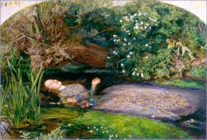
The piece that really catches my eye from this period is Ophelia by John Everett Millais. It depicts the tragic character from Shakespeare’s Hamlet as she drowns herself in the river, surrounded by flowers she has picked along the way. I am drawn to this painting for several reasons: One, I have a love for Shakespeare; Two, I am attracted to the colors and composition; and Three, because there is an underlying message being suggested about the struggles of women. I believe Millais was trying to point out the consequences of using and abusing women – the slippery slope that can lead to depression, insanity, and even death. I came to this conclusion while analyzing this painting at the Tate Britain, as I kept asking myself – Why Ophelia? Out of all the characters he could have depicted, why her? If you understand the background behind the madness of Ophelia, it all begins to make sense.


ophelia

John Everett Millais, Ophelia, 1851-52.


Moving away from contextual to a more formal analysis, I noticed that Millais seems to use cool colors here to create an aerial perspective for the viewer. Aerial perspective creates a more immense feeling of depth, and it feels as though I am standing on the banks of the river looking down upon Ophelia – almost as if I had just found her dead. Millais primarily uses cool colors in this painting; however, he mixes them with warmer colors such as yellows and deeper reds to bring the foreground out and to create the illusion that the bushes and trees on the riverbank are almost hovering over Ophelia. He uses the cool blues and grays in the river to set it back as well as to make it stand out against the bright greens and browns of the riverbank. Interestingly, my eyes are drawn to follow the river from left to right, and I feel as if my gaze flows with it.


When down her weedy trophies and herself

Fell in the weeping brook. Her clothes spread wide;

And, mermaid-like, awhile they bore her up;

Which time she chanted snatches of old

tunes;

As one incapable of her own distress,

Or like a creature native and indued

Unto that element: but long it could not be

Till that her garments, heavy with their drink,

Pull’d the poor wretch from her melodious lay

To muddy death.

Hamlet (4.7.172-181).

Posted in Uncategorized | Leave a comment

Romance versus Reality

Who is the greatest nineteenth century painter in British history?

This is a question that is frequently debated among art historians and students alike, and it seems to always come down to a contest between two – J.M.W Turner and John Constable. I kept this question in mind as I watched documentaries about each artist and studied their works at the National Gallery. It seems to me that the answer relies heavily on subjective opinion, even though supporters of both artists could supply facts and analyses as hard evidence as to why their artist is the best. As I walked through room 34 of the National Gallery, comparing and contrasting the two, it occurred to me that comparing them is like comparing a famous rapper to an famous country singer – each talented artist uses the same medium but manipulates it in a different way than the other. Me? I prefer Turner – and I’ll show you why.

J.M.W Turner was a romantic; fascinated by the ever-changing reflections of the Thames and the magnetic attraction of the sunset. His paintings epitomize the use of color as an expression of emotion. He was also influenced by poetry, and often wrote lines of poetry on the back of his canvases. He also drew on the eighteenth century concept of the sublime – the irrational, almost religious idea of ‘nature appreciation’ versus ‘nature terror’, of nature being ‘above’ us, and of viewing nature as a sort of elevated moral ecstasy.

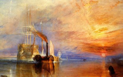
As a painter myself, I am extremely drawn to Turner, specifically to his liberal use of color. I connect with him on the premise that he would move the paint around with his fingers, as I often find myself manipulating my paintings in the same way. Looking at my favorite painting by Turner, The Fighting Temeraire (below), I am extremely impressed that he created the concept of perception and depth without the use of concrete lines but rather through contrasting warm and cool colors. The stark contrast of colors evokes a strong sense of awe within me, which is exactly what Turner had set out to do – evoke emotion in the viewer, whatever emotion that is. His goal is to make you feei. His painting lacks detail and structure, yet such an atmosphere is created by its composition – through its several verticals, the use of the Golden Section, and the use of light and color.


the fighting temeraire

John Mallord William Turner, The Fighting Temeraire, 1838.


Similar to Turner, John Constable was interested in nature; however, he painted landscapes as depictions of everyday English life. While Turner was interested in poetry, Constable was interested in weather, and studied it so that he could more accurately represent the clouds and sky in his works. Constable’s paintings are much more lifelike and and realistic, and there is substantial detail in each small fragment of his works. The compositions of his works were much more structured than that of Turner, as he used more horizontals, verticals, and curves rather than color to create dimension. While Turner borders on the abstract, Constable is on the verge of impressionism, using small brushstrokes to create minute details in his paintings.

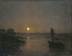
While there is no denying that Constable was an extremely talented artist, I am not drawn to his works in the same way that I am drawn to Turner’s. Maybe if I identified more with old English life I would have a greater appreciation for Constable. I love that Turner leaves many of his paintings open to interpretation – what you think and feel when you view it might be completely different than what I do. I also appreciate Turner’s versatility – some of his paintings are less structured and seemingly abstract while others are detailed and almost realist. See some more of my favorite Turner pieces below.


moonlight

Moonlight, a study at Millbank, 1797.

 dutch boats  Dutch Boats in a Gale, 1801.

Posted in composition, nineteenth century art | Tagged , , , , | Leave a comment